SIMPLIFYPLUSAI | INSIGHTS AND ARTICLES

Stop Copying the Face - Copy the Formula

Main thumbnail used for the article package. The argument is not that expressive faces never work, but that the face itself is not the engine. The promise has to pay off.

Article Overview

YouTube’s thumbnail problem does not begin with the open mouth, the bug eyes, or the fake shock face. It begins with the fact that YouTube’s own title-and-thumbnail testing system does not pick winners by raw click-through rate alone. It uses watch time share, which means the platform is not only asking which image can trigger a click. It is asking which title-and-thumbnail promise leads to actual viewing after the click.

That distinction changes the whole argument. A thumbnail is not just visual bait; it is the first promise a video makes to the viewer. Faces can work when they do a real job: recognition, emotion, scale, human stakes, or faster comprehension. The problem is not the existence of faces. The problem is creators copying the most visible surface of MrBeast-style thumbnails — open mouths, giant eyes, arrows, bright colors, theatrical panic — while missing the actual engine underneath: premise, clarity, curiosity, title-image alignment, and payoff.

The evidence points in the same direction. Kapwing’s analysis found surprised and happy expressions were common among top YouTuber thumbnails, but common does not mean universally transferable. YouTube’s own guidance treats CTR as only part of the picture, and its recent “egregious clickbait” enforcement shows that misleading titles and thumbnails are a trust issue, not just a design issue. Academic research on misleading thumbnails and clickbait detection also points back to the relationship between the thumbnail, title, and actual video content. The package cannot be judged honestly in isolation.

That is why the lazy open-mouth formula is decaying. At one point, the shocked face compressed emotion quickly. It told viewers something surprising, expensive, dangerous, funny, or absurd might be happening. But every attention tactic weakens when everyone copies it. Once the feed becomes a wall of shocked faces, the individual shock becomes wallpaper. Viewers recognize the trick, mock it, avoid it, and in some cases use tools that replace sensational thumbnails with more accurate ones. The tactic has shifted from human signal to credibility risk.

The open-mouth face will not disappear, and it should not. It still works when the content earns that emotional grammar. But a creator with a serious argument, a premium brand, a legal explainer, a finance channel, a medical topic, or a business analysis needs a different standard. The winning question is not “how do we make this look more viral?” It is “what is the clearest honest reason someone should care?” The mouth is not the machine. The machine is the promise — and the thumbnail’s job is to make that promise visible without breaking trust.

YouTube’s thumbnail problem does not begin with the open mouth, the bug eyes, or the fake look of astonishment that has spread across the platform like a visual rash. It begins with a quieter fact: YouTube’s own title-and-thumbnail testing system does not identify winners by raw click-through rate alone. It identifies winning versions by watch time share, which means the platform is not simply asking which image can trigger the fastest click. It is asking which title-and-thumbnail promise leads to actual viewing behavior after the click. YouTube’s help page says the highest-watch-time option is shown to viewers after a test, and it explains that the system optimizes for overall watch time over metrics like click-through rate because titles and thumbnails should help viewers understand what a video is about before they waste time clicking the wrong thing.

That single fact changes the entire argument. The thumbnail is not just a tiny poster, and it is not merely visual bait. It is the first promise a video makes to the viewer. The viewer sees an image and a title, forms an expectation, clicks, and then decides whether the video is delivering what the packaging implied. If the image wins curiosity but loses trust, the click was not a real victory. It was a borrowed moment of attention that may weaken the next one.

That is why the common imitation of MrBeast-style thumbnails is so shallow. People see the shocked expression, oversized face, bright colors, giant object, money, arrows, and forced emotional volume, then mistake the visible surface for the cause. But a giant challenge, impossible stunt, massive prize, transformation, or high-stakes social experiment already carries built-in curiosity before anyone makes a face. The expression may amplify the premise, but it does not create the premise.

The real question is not whether faces work. Sometimes they do. The better question is whether the face is doing a legitimate job. A face can create recognition, clarify emotion, humanize stakes, provide scale, or show a reaction that helps the viewer understand the story faster. But when the expression is louder than the actual premise, the image starts to feel false. The thumbnail is no longer communicating emotion. It is performing emotion.

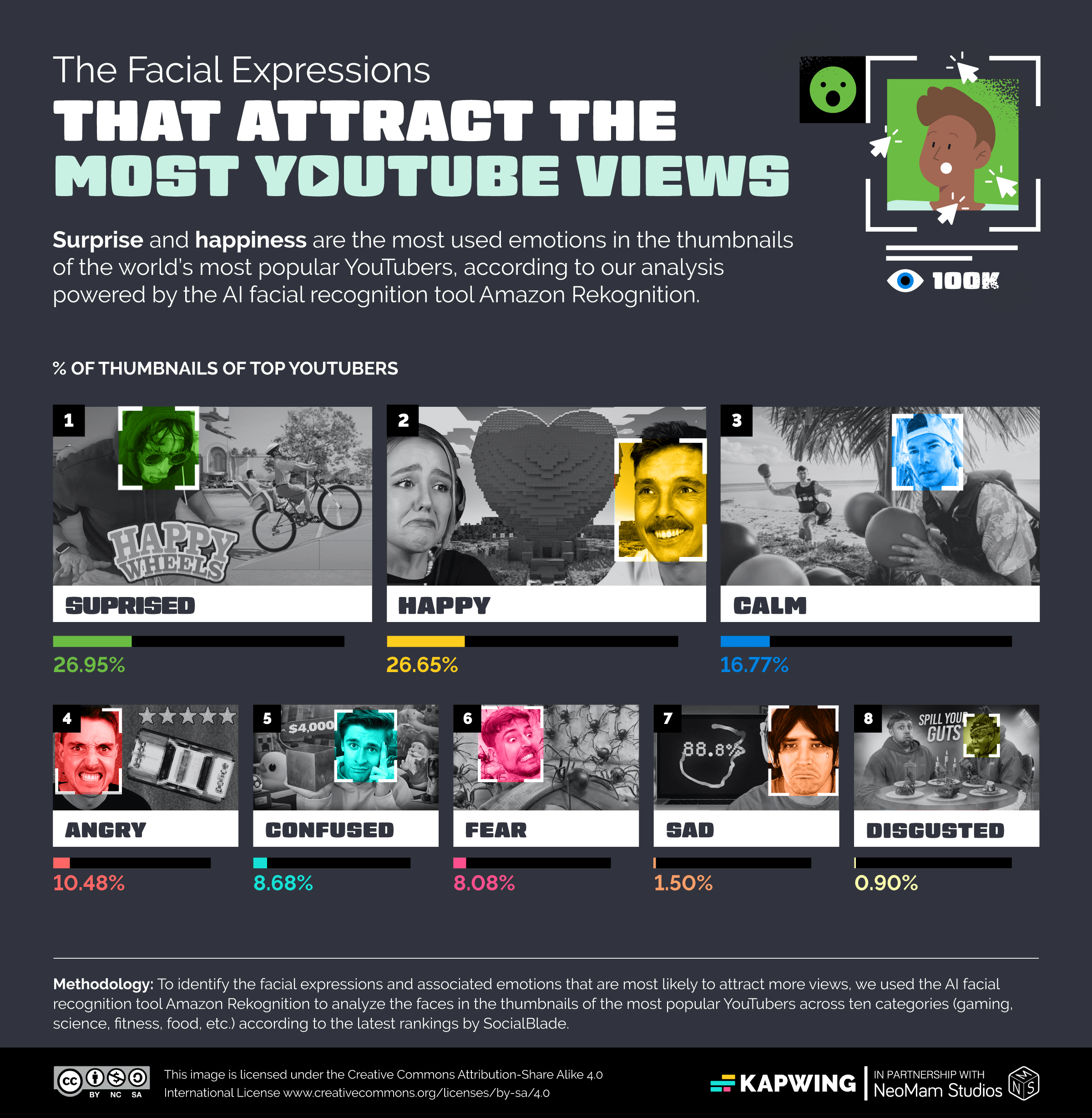
There is a reason creators copy the formula. Expressive faces are common among major YouTube creators. Kapwing’s analysis of top YouTuber thumbnails found that surprised and happy expressions were the two most common lead expressions in its sample, with surprised expressions appearing in 26.95 percent of thumbnails and happy expressions appearing in 26.65 percent. That is useful evidence, but it is not a universal law. It shows that visible emotion is common in high-performing creator ecosystems. It does not prove that every open-mouth face causes engagement, or that the same expression transfers across categories, audiences, and video premises.

The difference matters because creators often confuse correlation with instruction. If high-performing thumbnails often use faces, the shallow lesson is “use a face.” If those faces often look surprised, the shallow lesson is “look shocked.” If the biggest spectacle creators use exaggerated reactions, the shallow lesson is “make the dumb face.” That is not strategy. It is cargo-cult design. It copies the hood ornament and misses the engine.

The engine is the relationship between premise, clarity, curiosity, title, thumbnail, and payoff. A strong thumbnail interrupts the feed, but interruption alone is not enough. The viewer also has to understand what the video is about. The image has to create a specific curiosity gap rather than general confusion. The title and thumbnail have to work together instead of repeating or contradicting each other. Most importantly, the video has to pay off the expectation that the package created.


Kapwing’s real study graphic shows surprised and happy expressions as the most common lead emotions in its sample of top YouTuber thumbnails. Source: Kapwing, October 2024.

This is where the open-mouth thumbnail starts to break down. A shocked face can be earned by a real surprise, a real reveal, a real danger, a real absurdity, or a real transformation. It can also be completely ridiculous when pasted onto a routine tutorial, a mild commentary clip, a normal product review, a basic AI tool demo, or a business video that requires authority more than theatrical panic. The same expression that feels natural in a spectacle video can make a serious creator look desperate.

That does not mean serious channels should avoid emotion. It means they need the right emotional range. A finance video may need skepticism, concern, or controlled urgency. A documentary may need tension or moral weight. A tutorial may need a clear before-and-after result. A podcast clip may need recognizable faces and a sharp subject. A business analysis may need proof, contrast, or a visual contradiction. None of those categories are improved automatically by a creator pretending to be stunned by average information.

The deeper failure is that many thumbnails are trying to solve a premise problem with facial acting. If the idea has no stakes, no contradiction, no useful payoff, no transformation, no conflict, and no clear reason to care, the thumbnail designer is being asked to manufacture demand from nothing. That is when the arrows appear. That is when the background glows. That is when the mouth opens. The image gets louder because the idea is weak.

YouTube’s own policy language points in the same direction. In late 2024, YouTube announced stronger enforcement against “egregious clickbait,” describing it as cases where a title or thumbnail promises something the video does not deliver, especially around breaking news or current events. The company’s concern was not merely that these thumbnails looked tacky. It was that viewers could feel tricked, frustrated, or misled when packaging promises were not paid off inside the video.

That matters because it turns the thumbnail conversation from an aesthetic complaint into a trust problem. The issue is not simply that people are tired of goofy faces. The issue is that a thumbnail can train an audience to distrust the creator. A creator can win a click today and make the next click harder tomorrow. When viewers learn that every upload arrives wrapped in the same false emergency, the emergency stops working.

The public backlash is already easy to find. One Reddit thread about the YouTube “thumbnail face” frames the expression not as an attraction but as a reason to avoid the video, and the discussion around it reflects a broader fatigue with thumbnails that feel algorithmically exaggerated rather than human. A VI-Control forum thread treating “cringe YouTuber shock face” as a hall-of-fame object shows the same cultural shift from another angle: the expression has become recognizable enough to be mocked as a category. These threads are anecdotal, not scientific proof, but they are useful cultural evidence. Once viewers can name the trick, joke about it, and avoid it, the tactic has entered a weaker phase.

Some viewers have moved beyond annoyance and started defending themselves from the formula. DeArrow, a browser extension for YouTube, describes its purpose as crowdsourcing better titles and thumbnails so they are more accurate and less sensational. Its Chrome Web Store listing explicitly mentions reducing clickbait, arrows, and annoying faces by replacing thumbnails with submitted alternatives or screenshots from the video. That is an important signal. When viewers install tools to strip away the packaging, the packaging is no longer just a creative choice. It has become friction.

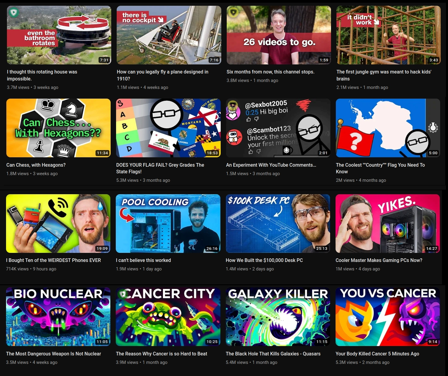
DeArrow’s official “before” view shows sensational titles, arrows, exaggerated expressions, and aggressive packaging on a real YouTube feed. Source: DeArrow official website.
DeArrow’s official “after” view replaces the same feed with calmer titles and video-frame thumbnails, illustrating the audience demand for more accurate packaging. Source: DeArrow official website.

Academic research around misleading YouTube thumbnails pushes the same point from a different direction. One 2025 paper on misleading thumbnails built a dataset of 2,843 videos from eight countries, including 1,359 misleading-thumbnail videos with more than 7.6 billion collective views, and framed misleading thumbnails as a problem for user trust and platform integrity. Other clickbait-detection research argues that real analysis has to examine the relationship between the video content and its title or thumbnail, not just surface metadata. That is the core issue: the thumbnail cannot be judged honestly in isolation.

A beautiful thumbnail can be bad if it promises the wrong video. An ugly thumbnail can work if it makes the right promise quickly. A loud thumbnail can win attention and still damage the creator if the viewer feels tricked. The correct standard is not “does this look clickable?” The correct standard is “does this image earn the attention it is trying to take?”

Real examples of the recognizable “YouTube face” formula on MrBeast thumbnails. Source: Popular Science / YouTube screenshot, July 2023.

The open-mouth trend is also suffering from visual inflation. At one point, the exaggerated YouTube face stood out because it compressed emotion quickly. It gave the feed a human signal. It told viewers that something surprising, funny, dangerous, expensive, absurd, or dramatic was happening. But every attention tactic weakens as more people use it. When the feed becomes a wall of shocked faces, the individual shock disappears. The expression becomes wallpaper.

That is why the cultural recognition of “YouTube Face” matters. Once a visual pattern becomes widely named, mocked, and understood as a platform formula, it enters a different stage. It may still work in some categories, but it no longer feels fresh. Viewers have learned the trick. The face now carries baggage. It can signal entertainment, but it can also signal bait.

The right answer is not to declare the tactic dead. That would be too easy and too false. Exaggerated faces can still work in challenge videos, gaming, reaction content, children’s entertainment, prank formats, drama channels, and spectacle-driven videos where the expression matches the premise. The mistake is treating one category’s visual grammar as a universal rule. A thumbnail style that works for an extreme challenge video may be poison for a legal explainer, a medical channel, a serious business analysis, or a premium brand.

A thumbnail should be judged by fit. Does the expression match the content? Does the face help the viewer understand faster? Is the person recognizable enough for the face to matter? Does the emotional tone suit the category? Would the image still be interesting if the face were removed? Does the title complete the image, or does it expose the image as empty? These questions are more useful than asking whether the thumbnail resembles whatever worked for a giant creator last year.

The useful lesson from top YouTube thumbnails is not “open your mouth,” “add giant eyes,” or “make everything brighter.” The useful lesson is premise compression. The best thumbnails reduce the decision. They make the viewer understand the offer quickly enough to care. They remove friction. They create a curiosity gap the video can actually close. They make the title and image work together instead of shouting the same vague promise twice.

That is also why mobile readability is not a minor design issue. A thumbnail that looks detailed and impressive at full size may collapse in the actual feed. Small text becomes texture. Background detail becomes noise. Multiple focal points fight each other. A face that seemed expressive on a desktop becomes unreadable on a phone. The real environment is not the designer’s canvas. It is the viewer’s feed at speed.

The strongest thumbnails usually have a clear hierarchy. The eye knows where to go first, second, and third. There is a dominant subject, a controlled background, a readable emotional or narrative signal, and a title that adds meaning rather than repeating the same information. Weak thumbnails often fail because every element is trying to be the hook. The face screams, the text screams, the arrow screams, the color screams, and the viewer gets no clean signal from the noise.

The most overlooked issue is trust. Creators often think of thumbnails as a click problem, but audiences experience them as a credibility problem. If the image repeatedly implies drama the video does not deliver, the audience learns to discount future promises. That may not show up in one thumbnail review, but it matters over time. A channel is not just building videos. It is building expectation memory.

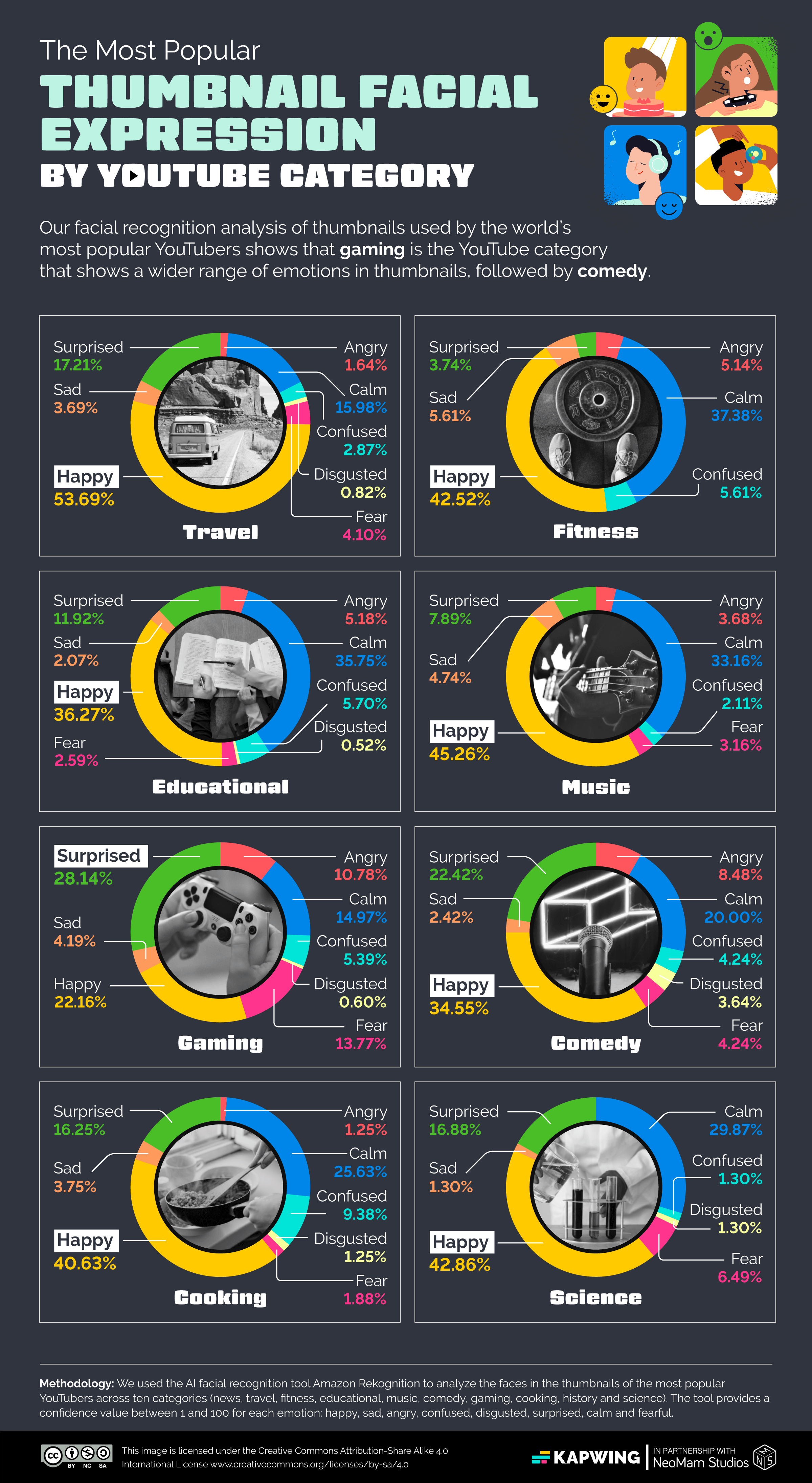
Kapwing’s category breakdown shows why one thumbnail grammar cannot be treated as universal: dominant expressions vary by YouTube category. Source: Kapwing, October 2024.

This is where the future of thumbnail strategy is likely to move. The next advantage will not come from louder emotional exaggeration. It will come from better-matched emotional signals, cleaner premise design, stronger mobile clarity, sharper title-thumbnail relationships, and more believable curiosity. The winning question will not be “how do we make this look more viral?” It will be “what is the clearest honest reason someone should care?”

The open-mouth face will not disappear. It will remain useful where the content earns it. But its lazy use will keep getting weaker as audiences become more fluent in the formula. A creator with a true spectacle can still use spectacle language. A creator with a serious argument needs a different grammar. A creator with a weak idea needs a stronger idea, not a bigger expression.

The mouth is not the machine. The machine is the promise. The thumbnail’s job is to make that promise visible, specific, and compelling without breaking trust. When creators copy only the face, they are not copying what worked. They are copying what was easiest to see. And in a feed already crowded with imitation, the easiest thing to copy is usually the first thing to decay.

Audience Reaction Analysis

Audience Temperature Gauge

220 comments coded from 233 parsed comment blocks; 13 excluded. Like counts were used when visible in the uploaded comments file. Some comments had no visible like count, so those were treated as “like count unavailable,” not as zero.

Audience Response Distribution

220 Comments Coded
Cringe / Disgust Response32.7%
Avoidance / Do-Not-Recommend Behavior23.6%
Algorithm Pressure / Effectiveness Debate12.3%
Humor / Punchline Reactions8.6%
Formula Fatigue / Copycat Critique8.2%
Trust and Quality Warning6.8%
Video Praise / Creator Support5.5%
Childish or Manipulative Read2.3%

Category Breakdown

RankCategoryCountShare
1Cringe / Disgust Response7232.7%
2Avoidance / Do-Not-Recommend Behavior5223.6%
3Algorithm Pressure / Effectiveness Debate2712.3%
4Humor / Punchline Reactions198.6%
5Formula Fatigue / Copycat Critique188.2%
6Trust and Quality Warning156.8%
7Video Praise / Creator Support125.5%
8Childish or Manipulative Read52.3%

Featured Audience Signals

Crowd Champion — Most-Liked Comment

@jdmjesus6103 — 309 likes

“I make a point of not clicking on any cringe face thumbnails, even if I like the creators videos normally. It's a stupid trend and I won't be a part of it!”

Why it matters: This comment captured the dominant audience behavior in one clean sentence: the issue is not just annoyance, but active refusal. Viewers are not merely mocking the face; some are changing their click behavior because of it.

Insight Laureate — Best Overall Comment

@AltoonaYourPiano

“Speaking as a viewer, whenever I see a clickbait thumbnail face, I steer clear of the video. I think of it in the same way I think of clickbait video titles. I assume that the content is low quality and they have to use gimmicks to attract viewers, like the YouTube version of supermarket tabloids. I know it's kind of unfair to prejudge a video like that, but I'm a bit of a dinosaur. I like my videos basic and to the point. The "person talks to the camera" videos that younger viewers might find boring, I love those! Speaking as a YouTuber, my thumbnails are basic and boring, just the way I like them. I aim for "just interesting enough for people interested in the topic to click on" but not so interesting that I run the risk of miscalculating my audience.”

Why it matters: This is the best comment because it gets past “I hate the face” and explains the real credibility mechanism. The commenter sees the thumbnail as a promise, reads exaggerated packaging as a quality signal, and frames good thumbnail strategy as matching the right audience instead of maximizing cheap curiosity. That directly strengthens the article’s core argument.

Top 5 High-Value Comments

1. Best audience-behavior signal — @24slipknot

“The "Do not recommend this channel" function is the best thing to ever happen to youtube. I see a clickbait title or cringe thumbnail and I click it away and any other to follow for good.”

Why it matters: This shows the thumbnail formula can trigger platform-level rejection, not just a missed click. That is strong evidence for the article’s trust and expectation-memory argument.

2. Best authenticity distinction — @Sword_Boi

“I'm okay with taking a screenshot of a genuine expression you made in the video and using that for the thumbnail. What I don't like is people reusing stock photos of themselves reacting to nothing. Especially when they are wearing different clothes in the thumbnail to the video; it makes it feel more artificial and desperate to me.”

Why it matters: This comment separates earned expression from manufactured expression. That distinction is important because the article is not anti-face; it is anti-false-promise.

3. Best category-fit nuance — @Mo_goes_miles

“Having to put myself on the thumbnail for the algorithm is bad enough! So putting silly faces on it is a step too far for me. I generally don't click on those videos as the stupid faces are off-putting and appear childish. Fine if you have a comedy channel though!”

Why it matters: This adds nuance. The commenter does not declare the tactic universally dead. They recognize that it may fit comedy, but fails when the emotional grammar does not match the content.

4. Best creator-pressure signal — @MrJollyRoger

“Thanks for doing this experiment. I'm trying to grow my tiny gaming channel, and thought that I might have to go this kind of route. Pleased that I don't have to! Have a good one”

Why it matters: This comment shows why the formula spreads. Smaller creators may feel forced to copy a style they dislike because they think the algorithm demands it.

5. Best humor / crowd punchline — @CherryPascalle

“If I were king, I would force anyone with a face like that in the thumbnail to walk around with that expression for a week. I would be a hard but righteous king.”

Why it matters: This is the funniest high-signal comment because it turns the audience’s irritation into a vivid test: if the expression is too absurd to wear in real life, it may also be too fake to carry trust in a thumbnail.

Arena Read

The crowd reaction was not simply that people find the YouTube open-mouth face annoying. The dominant response was that many viewers now treat the formula as a negative signal: they avoid clicking, use “Do not recommend,” unsubscribe, or assume the video is lower quality before watching it. The strongest comments added nuance by separating genuine expression from staged thumbnail acting, and by recognizing that the tactic may still work in comedy or spectacle formats. The comment section strongly supports the article’s thesis: the mouth is not the machine. The machine is the promise, and this audience increasingly distrusts the promise when the face feels fake.

Comment Selection Disclaimer

Comments are selected for the value of the comment itself — clarity, insight, humor, public reaction, factual relevance, or contribution to the discussion. Selection does not endorse, investigate, validate, or judge the person who posted it. We do not research commenters’ personal histories, beliefs, affiliations, conduct, or online activity. A strong comment is treated as a strong comment, not as a character reference for the commenter.

We are evaluating the comment, not certifying the commenter.

Back to Articles